Having your video looking professional can be the difference between a viewer watching your entire video, or switching off after a few seconds. Using the likes of Adobe Premiere Pro and Sony Vegas to edit the colour correction and grading of videos can be difficult but a great way to make your video look professional and cinematic.
The video below is part two of the ProfileTree colour tutorial on Adobe Premiere Pro. To watch the first part click here.
The video is also part six of an Adobe Premiere Pro CC tutorial series.
Table of Contents
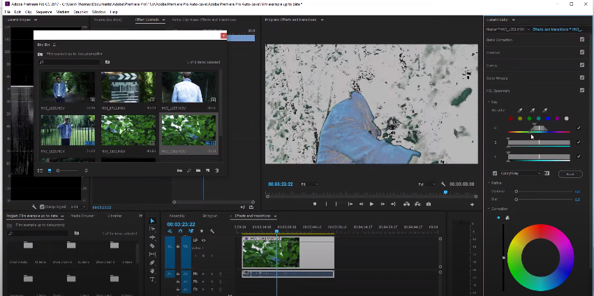
Mask Inconsistency in Adobe Premiere Pro
When a user creates a mask in Premiere Pro, the software tries to follow the subject or object in the mask to the best of its ability. The software can become confused sometimes and it won’t follow the mask correctly. But it is generally consistent.

The best way to get around this is by tracking backwards. Place the mask accurately on the last key-frame of the mask and tracked the key-frames backwards.
Correcting a video on Adobe Premiere Pro
There are many ways a user can correct their video within Adobe Premiere Pro. Options include HSL colour (Hue, Saturation and Light), temperature, tint, contrast, sharpen and saturation. Beneath the HSL settings is a correction feature. This feature is a colour wheel.
This colour wheel can really change the colour of your video. It can bring out great skin tones, great environment tones and much more. With the colour wheel, it has the five options that’re spoken in the paragraph previous, such as the contrast and temperature. This allows the colours of the video to feel more natural and genuine.
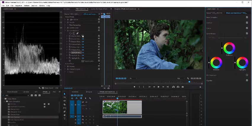
How to Use the Colour Balance in Adobe Premiere Pro
To get started with using colour balance, you will need to head to the effects library and search for the colour balance effect. Once you find the colour balance effect, drag and drop the effect into your workflow.
When you drag the colour balance into your workflow, the effect controls panel will show. Here you will find all the RGB colours, just like the ones that you seen at the right. You can really play with the colours of the video to suit your needs. You can also play with the highlights of the video from here. You can also add masks from here too.
Creating a Cinematic Look
One of the best ways to create a more cinematic look is by the using the effect options such as contrast and saturation. Many different types of films use different contrasts and effects. A western uses a lot of orange and yellow tones, whereas an action movie such as Taken would use a lot of dark colours and tones.
Benefits of Colour Grading: Enhanced Mood, Storytelling, and Professionalism
Colour grading isn’t just about making your footage look pretty; it’s a powerful tool that can elevate your video project on multiple levels. Let’s dive into how colour grading enhances mood, storytelling, and professionalism:
1. Enhanced Mood:
- Emotional manipulation: Colours have strong psychological connotations. Warm tones like orange and red invoke feelings of excitement, energy, and passion, while cool tones like blue and green create a sense of calm, mystery, or melancholy. Colour grading allows you to manipulate these emotions within your audience, setting the tone for your story and influencing their perception of the scene.
- Building atmosphere: By adjusting the overall colour palette and applying selective grading techniques, you can create specific atmospheres. For example, you can make a scene feel dreamy and surreal by boosting saturation and adding a soft pastel tint, or create a gritty and suspenseful mood by desaturating colours and increasing contrast.
- Highlighting character emotions: You can subtly emphasize a character’s emotional state through colour. For instance, using warmer tones around a happy character or cooler tones around a sad one can subliminally reinforce their emotions without relying solely on dialogue or acting.
2. Storytelling:
- Visual cues and symbolism: Colour can be used as a powerful storytelling tool. Certain colours can be associated with specific themes, objects, or characters, creating visual cues that guide the audience’s understanding of the narrative. For example, recurring use of red might foreshadow danger or violence, while green could symbolize environmental themes or hope.
- Scene transitions and continuity: Colour grading can help smooth out transitions between scenes and establish visual continuity throughout your video. By matching the colour palettes of different shots, you can create a cohesive flow and avoid jarring jumps in the visual style.
- Emphasis and direction: Selective colour grading can draw the audience’s attention to specific elements within a scene. By brightening or saturating key objects or characters, you can subtly guide their focus and emphasize important moments in the story.
3. Professionalism:
- Polished and high-quality look: A well-graded video appears polished and professional, instantly increasing its perceived value. Good colour grading indicates attention to detail and enhances the overall production value of your project.
- Brand consistency: Colour palettes can be a key element of brand identity. Consistent colour grading across your videos helps establish brand recognition and strengthens your visual communication.
- Standing out from the crowd: In a sea of amateur-looking videos, professional colour grading can help your project stand out and differentiate itself from the competition. It demonstrates your commitment to quality and elevates your brand image.
By mastering the art of colour grading, you can unlock a powerful tool that goes beyond aesthetics. You can manipulate emotions, enhance storytelling, and project professionalism, ultimately taking your video projects to the next level.
Additional Tips:
- Remember, there’s no one-size-fits-all approach to colour grading. Experiment with different techniques and find what works best for your specific project and message.
- Don’t be afraid to be creative! Use colour grading to express your unique vision and add a personal touch to your storytelling.
- Consider your target audience and the overall tone of your video when choosing a colour palette.
- Seek inspiration from other well-graded films and videos, but don’t be afraid to put your own spin on things.
Types of Colour Grading: Tailoring the Palette to Your Story
Colour grading isn’t a one-size-fits-all approach. Every genre and type of video has its own stylistic language, and colour grading plays a crucial role in setting the tone and enhancing the viewer’s experience. Let’s explore some common types of colour grading and how they contribute to different creative contexts:
1. Cinematic Grading:
- High contrast and dramatic tones: Cinematic grading often utilizes deep blacks, vibrant colours, and dramatic lighting to create a heightened sense of realism and immersion. Expect to see techniques like teal and orange grading, crushed blacks, and boosted contrast, evoking the atmosphere of Hollywood blockbusters.
- Stylized palettes and emotional manipulation: Colour palettes can be carefully chosen to reflect specific themes or emotions. For example, a historical drama might lean towards muted earth tones, while a sci-fi film might embrace neon hues and futuristic colour schemes.
- Subtle adjustments and artistic flair: Cinematic grading aims to be realistic yet artistically nuanced. Subtle shifts in tone can subtly influence the audience’s emotional response, enhancing character development and plot tension.
2. Documentary Grading:
- Naturalistic and authentic: Documentary grading strives for a natural and realistic look, prioritizing accurate colour representation and minimal manipulation. Techniques like three-way colour correction and slight contrast adjustments are commonly used to enhance clarity and detail without sacrificing the documentary’s inherent truthfulness.
- Highlighting specific elements: Selective grading can be used to draw attention to key moments or individuals within the documentary. For example, you might warm the tone during an interview segment to make the speaker seem more relatable, or desaturate a scene to emphasize its historical context.
- Maintaining consistency and objectivity: Although subtle adjustments are acceptable, documentary grading should avoid excessive stylization or manipulation that could compromise the viewer’s trust in the film’s objectivity.
3. Commercial Grading:
- Bold colours and eye-catching visuals: Commercial grading aims to grab attention and leave a lasting impression. Expect vibrant colours, high contrast, and dynamic lighting to make the product stand out and evoke a positive emotional response.
- Brand identity and target audience: Colour palettes are often chosen to align with the brand’s established identity and resonate with the target audience. A luxury brand might utilize sophisticated gold and black tones, while a children’s toy commercial might embrace a playful and colourful palette.
- Fast-paced editing and quick cuts: Commercial grading needs to adapt to the dynamic pace of editing, with quick transitions and color shifts used to enhance the rhythm and energy of the commercial.
4. Music Video Grading:
- Artistic expression and creative freedom: Music videos offer a playground for experimentation and artistic expression. Colour grading can become an integral part of the story, reflecting the mood and themes of the music. Expect bold palettes, neon accents, and dynamic shifts in tone to match the musical energy.
- Genre-specific influences: Different music genres might call for unique colour grading approaches. A hip-hop video might embrace cool blues and urban grit, while a pop song might explode with vibrant pinks and yellows.
- Matching the artist’s vision: Ultimately, music video grading serves the artist’s vision and the overall creative concept. Collaborative communication between the director, colorist, and musicians is crucial in achieving the desired effect.
5. Social Media Content Grading:
- Mobile viewing optimization: Colour grading for social media platforms needs to consider the smaller screen format and viewing conditions. Bright colours and high contrast help videos stand out in feeds, while ensuring the palette remains visible even on mobile devices with limited brightness.
- Trending styles and engagement: Understanding current trends and popular colour palettes on specific platforms is key to grabbing attention. For example, Instagram might favor warm and soft tones, while TikTok often embraces high-contrast and vibrant neon looks.
- Short format and quick impact: Social media videos are short and need to make an immediate impression. Colour grading helps set the tone and engage viewers within the first few seconds, encouraging them to watch and interact further.
Comparison of DaVinci Resolve and Final Cut Pro as software alternatives for colour grading and correction:
DaVinci Resolve:
Overview:
- Professional-grade software, industry-renowned for colour grading and advanced editing features.
- Free version available with comprehensive tools, paid version (DaVinci Resolve Studio) unlocks advanced features.
- Widely used in Hollywood and high-end productions.
Strengths:
- Unparalleled colour grading capabilities, including exceptional scopes, curves, and advanced tools.
- Node-based workflow for precise control and complex grading techniques.
- Excellent integration with Blackmagic cameras and hardware.
- Growing popularity in the independent filmmaking community.
- Supports 3D and multi-user collaboration (Studio version).
Weaknesses:
- Steeper learning curve, especially for beginners.
- Can be resource-intensive, requiring a powerful computer.
- Some users find the interface less intuitive than Final Cut Pro.
Final Cut Pro:
Overview:
- Apple’s flagship video editing software, known for its intuitive interface and seamless integration with macOS.
- Paid software, exclusively available for Mac users.
- Popular choice among YouTubers, independent filmmakers, and Apple enthusiasts.
Strengths:
- User-friendly interface, relatively easy to learn.
- Efficient and optimized for Mac hardware.
- Seamless integration with other Apple products and services.
- Powerful colour correction tools, including the Color Wheels and Color Board.
- Excellent magnetic timeline for efficient editing.
Weaknesses:
- Limited color grading capabilities compared to DaVinci Resolve.
- Lacks node-based workflow and some advanced features.
- Exclusive to macOS, not available for Windows users.
Choosing the Right Software:
Consider the following factors when choosing:
- Experience level: Beginners might find Final Cut Pro more approachable, while experienced colourists might prefer DaVinci Resolve’s depth.
- Features: Evaluate the specific tools and workflows you require for your projects.
- Hardware: DaVinci Resolve can be demanding on hardware, ensure your system is compatible.
- Budget: DaVinci Resolve offers a free version, while Final Cut Pro is a paid software.
- Collaboration: If working with a team, consider DaVinci Resolve’s multi-user collaboration features.
- Integration: If heavily invested in Apple’s ecosystem, Final Cut Pro might offer a smoother experience.
Best Practices:
- Experiment with both: Download trial versions or utilize the free DaVinci Resolve to explore their interfaces and capabilities.
- Consider your workflow: Assess how each software aligns with your editing and grading style.
- Seek feedback: Consult with other filmmakers and editors for their experiences and recommendations.
Ultimately, the best choice depends on your individual needs, preferences, and project requirements. Both DaVinci Resolve and Final Cut Pro offer excellent colour grading tools, each with its unique strengths and weaknesses.
Hardware Considerations for Colour Grading: Monitors and Calibration Tools
When it comes to achieving accurate and stunning colour grading, your hardware plays a crucial role. Two key elements deserve special attention: your monitor and calibration tools. Here’s a detailed breakdown of their importance and things to consider:
1. Monitors:
- Colour accuracy and fidelity: The key element for colour grading is a monitor that displays colours accurately and consistently. Look for panels with high gamut coverage (ideally DCI-P3 or Rec. 709) and accurate Delta E readings (ideally below 2).
- Resolution and display size: While 4K resolution is increasingly preferred, even a high-quality Full HD monitor can be sufficient for some workflows. Choose a size that allows comfortable viewing without needing to zoom in frequently.
- Brightness and contrast: Aim for a monitor with high brightness levels (300 nits or higher) and good contrast ratios (1000:1 or more) for optimal visibility and detail in both dark and bright areas.
- Panel technology: IPS panels offer the best viewing angles and colour accuracy for colour grading. TN panels tend to be slower and have less accurate colours, while VA panels can have better contrast but may have limited viewing angles.
2. Calibration Tools:
- Ensuring consistency and accuracy: Even high-quality monitors can drift in colour over time, due to environmental factors like temperature and humidity. Regularly calibrating your monitor using a hardware calibrator ensures consistent and accurate colour representation.
- Popular calibrators: X-Rite i1Display Pro Plus, Datacolor SpyderX Pro are reliable options.
- Calibration process: These tools use a probe that measures the colours displayed on your screen and generates a custom profile that corrects any inaccuracies. It’s a simple yet essential process for accurate colour grading.
- Software integration: Some color grading software, like DaVinci Resolve, seamlessly integrates with calibration tools for a smooth workflow.
Additional Hardware Considerations:
- Graphics card: A powerful graphics card is essential for smooth playback and handling demanding colour grading operations, especially with high-resolution footage.
- CPUs and RAM: While not as crucial as the monitor and graphics card, a strong CPU and sufficient RAM will contribute to overall system performance and responsiveness.
- Storage: Fast SSD storage significantly improves loading times and overall workflow efficiency when working with large video files.
Tips for Choosing the Right Hardware:
- Match your budget: While high-end monitors and calibrators offer superior precision, affordable options are available for beginner or hobbyist colorists.
- Do your research: Read reviews and compare specifications of different monitors and calibrators before making a purchase.
- Consider your workflow: Choose a monitor size and resolution that suits your working space and preferences.
- Seek advice: Consult with experienced colorists or professional studios for recommendations based on your specific needs.
FAQs (Colour Grading and Correcting in Adobe Premiere Pro CC)
Q: I’m new to Premiere Pro and colour grading. Where should I start?
A: Explore the Lumetri Color panel – it’s your gateway for basic and advanced colour adjustments. Start with understanding the primary tools like White Balance, Levels, Curves, and Color Wheels. Practice making subtle adjustments and familiarizing yourself with the interface.
Q: What are some common problems I might face during colour grading?
A: Overcorrecting colours, washed-out footage, and inconsistent skin tones are common issues. Remember, less is often more! Start with small adjustments and avoid drastic changes. Pay close attention to skin tones and ensure they remain natural throughout your footage.
Q: Is Premiere Pro enough for professional-level colour grading?
A: While not as specialized as DaVinci Resolve, Premiere Pro offers powerful tools for achieving professional-looking results. With dedicated time and practice, you can create stunning colour grades within Premiere Pro itself. However, if your projects require high-end workflows and advanced features, consider exploring dedicated colour grading software.
Q: What are some resources for learning colour grading in Premiere Pro?
A: Adobe themselves offer comprehensive tutorials and resources within their website. Plenty of independent creators also offer insightful YouTube tutorials and online courses specifically focused on colour grading in Premiere Pro. Don’t hesitate to seek out communities and forums for further learning and support.
Q: What hardware should I consider for colour grading in Premiere Pro?
A: Invest in a good quality monitor with accurate colour representation and decent brightness. Calibrate it regularly to ensure consistency. A powerful PC with a dedicated graphics card will also enhance performance and responsiveness, especially when working with high-resolution footage.
Conclusion
Mastering colour grading in Premiere Pro opens a world of creative possibilities for your video projects. By understanding the fundamentals, practicing with the provided tools, and continually seeking new knowledge, you can elevate your visuals, tell captivating stories, and leave a lasting impression on your audience.
Remember, patience, experimentation, and a constant thirst for learning are key ingredients in your colour grading journey. So, unleash your creativity, embrace the power of colour, and take your editing skills to the next level!
Want to learn more from Adobe?
Colour Grading and Masking – Using Timeline and Workflow – Transitions, Titles and Effects – Video Editing – How to Render and Export – Audio Effects and Editing Sound – Layouts and Workflow
 ProfileTree